STK Pro, STK Premium (Air), STK Premium (Space), or STK Enterprise
You can obtain the necessary licenses for this tutorial by contacting AGI Support at support@agi.com or 1-800-924-7244.
The following tips will help you take great pictures using STK. The AGI Marketing and Production teams have used these tips to produce the images you see on the AGI website, at trade shows, and marketing events.
Capabilities Covered
This lesson covers the following STK Capabilities:
- STK Pro
Quick Start Reference
Here is a quick start reference of tips that will help those familiar with STK. For additional tips, see Additional Tips.
| STK Option | Tip |
|---|---|
| Resolution | Use standard image aspect ratios (16:9, 3:4, etc.) 1280x720 or 1024x768 are decent sizes. For additional tips, see Resolution. |
| Fonts | Universe, Futura, or Lucida are good fonts to use. Recommended sizes are: small - 20, medium - 22. Outlines and background are also good. For additional tips, see Fonts. |
| Lighting | Adjust object: ambient (10-25) and Sun (90-125). For additional tips, see Lighting. |
| Anti-Aliasing | Use when possible. 4x4 is recommended. |
| Line thickness | For important lines, increase the thickness by three levels. |
| Clutter | Clutter can ruin your picture. If an object/label/line is not important to your image, turn it off. |
| Labels | Use label offsets to ensure that they are visible if you want them to be seen. |
| Colors | Be mindful of contrast. Reds and Blues do not show up well in the Graphics windows, but green, yellow, and cyan do. |
| Field of view | Use a camera zoom. Larger = you can see more. 45-60 degree field of view is recommended. There can be warping over 65 degrees. |
| Models | Use the best model possible for close-ups. |
Additional Tips
Resolution
The higher the resolution, the better the image will look. Check to see what the requirements are for the image (that is, where the image will be displayed), and determine the highest resolution that will fit. The same applies to the aspect ratio. If you don't know what the required resolution is, shoot for something standard, such as 1280x720 pixels (16:9 widescreen) or 1024x768 (4:3 standard). Window resolutions can be set in the 3D Graphics Properties - Window Properties page.
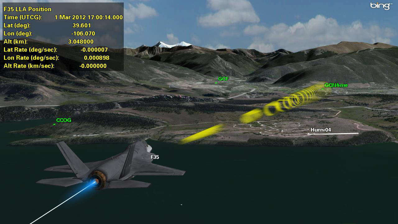
The following image uses the default lighting settings.

Compare the above image with the following image that uses user-defined lighting settings.
Fonts
The default font in STK can be difficult to read, especially if kept at the default size. For clearer images, use the Universe font. If you do not have the Universe font, Futura and Lucida are also good alternatives. The idea is to use a font that is large and easy to read.
You can increase the font size to make all text slightly larger in the Scenario Properties - 3D Graphics page. On that page, you will find the font field. We recommend using something around 20-22 for small type and 22 for medium type. Enabling font outlines and using a background for data displays can help make the fonts easier to read.
Lighting
The default lighting is not optimized for pictures. The ambient light is blown out by default so everything is visible in the scenario. This makes it easy to see what you are doing, but is not ideal for pictures. Try tweaking the lighting settings in the 3D Graphics Properties - Lighting page. The following properties page shows some general values that are good to start with, which can be tweaked as needed.

Adjust the object: ambient (10-25) and Sun (90-125) levels to try to make your models look more three dimensional. Models with the default lighting enabled can look blown out and flat, with no dark regions. Decrease the ambient light a bit to see more variation across the surface of the models. You may be surprised at how much better the models can look.
Additional lights can sometimes be needed to light scenarios. The best example is a nighttime scenario. The scene is too dark by default, but turning up ambient lighting makes it look like daytime. One trick is to create custom light shining in the reverse direction.
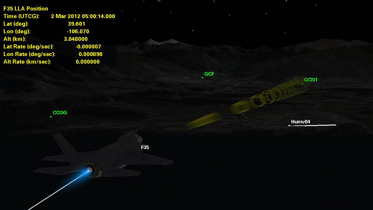
The following nighttime picture uses the default settings.
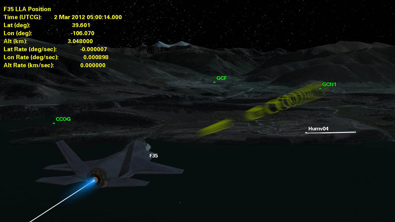
Compare the above image with the following nighttime picture that uses user-defined settings.
Sensors
Smoothing those pulsing sensors helps a lot. The transparency can be tweaked so sensors are visible, but not blocking everything else out. If there are cutoffs in your sensors when zooming in and out using the camera, try increasing the Far/Near ratio. You can find this ratio in the 3D Graphics Properties - Advanced page.
Models
AGI has some nicer models - use them! If you need to use a really plain or basic model, a close-up picture may not be the best option. Search the resource section of AGI.com for better models. AGI also has models for an ocean surface if you are doing close ship scenes, sky domes for adding impressive clouds/skies to your background, high resolution stars, etc.
Terrain/Imagery
When possible, use terrain and imagery. It adds visual depth and makes for a more interesting picture.