STK Enterprise
You can obtain the necessary licenses for this tutorial by contacting AGI Support at support@agi.com or 1-800-924-7244.
Capabilities covered
- Test and Evaluation Tool Kit (TETK)
- STK Pro
- Radar
Cleaning up the 3D Graphics window
You will now focus on the Flight Analysis Tool. To clean up the 3D Graphics window, toggle off the Ship, Target1, and Target2 in the Object Browser.
- Open the Flight Segment Definition (
 ) window.
 - Clear the RF and RADAR check boxes. This removes the time intervals from the Timeline View.
- Close the window.
- Open the Flight Segment Control (
 ) window.
 - Click the On/Off button column for each RF run to set them to Off. The Seg, Ann, and Assets check boxes should no longer be checked. Note the following:
- Seg (segment) refers to the colored lines that hover over the route
- Ann (annotation) refers to the data display labels in the 3D Graphics window
- Assets refers to the link lines that connect the ownship to its designated assets
- Repeat step 5 for the RADAR segments by selecting RADAR from the SubSystem drop-down.
- Close the window.
Adding Time Components
Time Components are used to create custom time instants and intervals and can be dependent on data. Time intervals can be used as a time filter for various graphics like event markers, data displays, and graphs. They can also be used as time filters in various analytical workflows in the Ansys Test and Evaluation Tool Kit (TETK)™ capability. Custom time components can also be displayed in the Ansys Systems Tool Kit® (STK®) digital mission engineering software's Timeline View.
Adding Manual Times
- On the Flight Analysis Tool toolbar, click the Create Time Component (
 ) button and choose Manual Times.
 - Name the time component SampleTimeInstants.
- Add time instants to the time component.
You can add instants in two ways:
- Manually enter a specific time of interest in the field
- Scrub through the animation to an interesting point in time and click the clock button (
 ) to grab the current animation time. Then, click add (
 ) to add the time to the list. Add as many time instants as desired.
- Ensure the Label check box is checked and enter SampleTimeInstants in the field.
- Select the Icon check box and click the ellipsis (
 ) to browse to an icon marker.
 - Select the Finder_Cyan2.png icon and click .
- Click to finish creating the manual times.
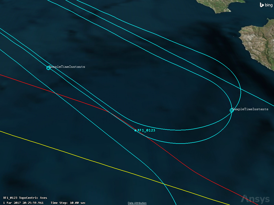
- These newly created time instants will now display in three areas:
- In the Flight Analysis Tool, a Time Component and EventMarker category with the SampleTimeInstants are listed. Here you can toggle them on and off.
- In the 3D Graphics window, all the times you set marked with the cyan marker, and the SampleTimeInstants label are visible.
- In the Timeline View, a SampleTimeInstants time component with each of the set times if checked in the Flight Analysis Tool is visible (you may have to toggle the Time Component ON to see it here.) You can right-click them in the Timeline View and choose Set Animation Time Here to jump to any of the times.
Adding Manual Intervals
- In the Flight Analysis Tool toolbar, click the Create Time Component (
 ) button and choose Manual Intervals.
 - Name the time component SampleTimeIntervals.
- Add time intervals to the time component.
You can add intervals in two ways:
- Manually enter a specific time of interest in the Start/Stop fields.
- Scrub through the animation to an interesting point in time and click the clock button (
 ) to grab the current animation time for the Start value. Scrub to a later time in the STK timeline view and click the clock button (
 ) to grab the current animation time for the Stop value. Then, click the add button (
 ) to add the interval to the list. Add as many time intervals as desired.
- Ensure the Label check box is checked and enter SampleTimeIntervals in the field.
- Select the Icon check box and click the ellipsis (
 ) to browse to an icon marker.
 - Select the MarkerRed.png icon and click .
- Click to finish creating the manual intervals.
Like the time instants, you will see these intervals populate in the Flight Analysis Tool, which you can toggle on and off.
Adding Metric Satisfaction Intervals (Calibrated Air Speed)
- In the Flight Analysis Tool toolbar, click the Create Time Component (
 ) button and choose Metric Satisfaction Intervals.
 - Change the Name to CAS_230-280knots.
- Click the Data Element button (
 ). Expand Ownship.csv, select Cal Air Speed, then click .
 - Click , and it will auto-populate the Min and Max fields.
- Click the graph button (
 ) next to the data element field to open a quick graph of the calibrated air speed over the ownship’s entire flight. The vertical line corresponds to the current animation time. This can be used to quickly gain perspective on the range of values for that data element.
 - Click the Properties button (
 ) and change the Y Units to knots.
 - Click .
- Navigate to the Time Component Metric Satisfaction panel and verify the units pull downs are set to knots.
- Enter 230 in the Min field and 280 in the Max field.
- Verify the Label field is checked and enter CAS_230-280knots.
- Click .
- Clear the EventMarker check box in the Flight Analysis Tool. This hides all event markers to keep the 3D Graphics window clean.
- Close the graph.
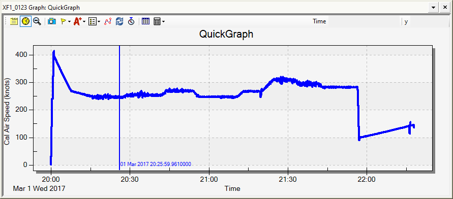
You want to determine the time where the CAS is between 230 and 280 knots.
Similar to the manual time intervals created before, you will see these CAS intervals populate in the Flight Analysis Tool, which you can toggle on and off. These intervals are based on the ownship CAS metric when it is between 230 and 280 knots.
Adding Multi-Metric Satisfaction Intervals (Calibrated Air Speed and Altitude)
- On the Flight Analysis toolbar, click the Create Time Component button (
 ) and choose Multi-Metric Satisfaction Intervals.
 - Under Metric, click the Data Element button (
 ).
). - Expand ownship.csv, select Cal Air Speed.
- Click .
- Enter 230 in the Min field and 280 in the Max field.
- Click the Add button (
 ) to add a second metric.
 - Under Metric, click the Data Element button (
 ) for the second metric.
 - Expand Ownship.csv and select Altitude_MSL.
- Click .
- Verify the units drop-down is set to ft.
- Enter 28000in the Min field and 34000in the Max field.
- Click .
- Change the name to CAS_Alt_Req.
- Verify the Label field is checked and enter CAS_Alt_Req.. You can optionally add an icon.
- Click .
- Save your scenario.
You want to determine not only the time where the CAS is between 230 and 280 knots, but also where the Altitude_MSL is between 28000 and 34000 feet to satisfy both requirements.
Similar to the metric satisfaction intervals created before, you will see the new multi-metric intervals populate in the Flight Analysis Tool, which you can toggle On and Off. These are conditional intervals based on the ownship CAS metric and the Altitude_MSL metric and are satisfied when both CAS is between 230 and 280 knots and Altitude_MSL is between 28000 and 34000 ft.
Adding contour lines
The Contour Line tool enables you to create color contour lines from external data sources. A contour line colors the vehicle path based on the value of the selected data element.
Adding contour lines From Metric (Calibrated Air Speed)
- In the Flight Analysis Tool toolbar, click the Color Contour the Flight Path (
 ) button and choose From Metric...
 - Name the contour CAS_230-280knots.
- Click the Data Element button (
 ), expand Ownship.csv, select Cal Air Speed, then click .
 - Under Contour Levels, change the Add Method: to Explicit Range.
- Set the units to knots.
- Set Start to 230 knots and Stop to 280 knots.
- Click the to add the new range.
- Under the Levels section, select the check-boxes next to Include values below min contour level and Include values above max contour level.
- In the Levels table:
- Change the <= 230 color to red by double-clicking the color swatch.
- Change the 230 to 280 color to green by double-clicking the color swatch.
- Change the > 280 color to blue by double-clicking the color swatch.
- Clear the Line Offset check box and increase the line width to 5. This places the contour line directly on the ownship's flight path.
- Click .
- You now see the ownship route is colorized based on the CAS values, where red is below 230 knots, green is between 230 and 280 knots, and blue is above 280 knots.
Adding contour lines from Metric (Dynamic Pressure)
- In the Flight Analysis Tool toolbar, click the Color Contour the Flight Path (
 ) button and choose From Metric...
 - Click the Data Element button (
 ), expand Ownship.csv, select Dynamic Pressure, then click .
 - Click the Quick Graph button (
 ) to examine the plot against time.
 - Navigate back to the Contour Line panel.
- Confirm that Level Adding - Add Method is set to Start, Stop, Step.
- Set the Units to kPa.
- Enter 8in the Start box and 16in the Stop box.
- Enter 8 in the Num Steps box.
- Set Level Colors to Diverging.
- Click , and the levels will be added to the table.
- Change the Name to DynPres_8-16kPa.
- Under Line Settings Line Offset, change the units to m and offset the line vertically by 10 m. This will draw the contour line 10 m above the ownship’s route so it will not overlap the CAS contour line.
- Increase the line width to 5.
- Click .
- Clear both contour line check boxes from the Flight Analysis Tool to clean up the 3D Graphics window.
- If the ownship’s original route is no longer visible, right-click XF1_0123 in the Flight Analysis Tool and choose Show/Hide Route.
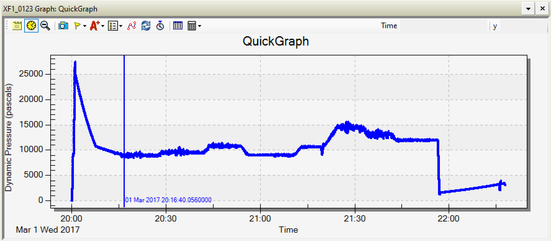
You want to determine the time where the Dynamic Pressure is between 8 and 16 kPa.
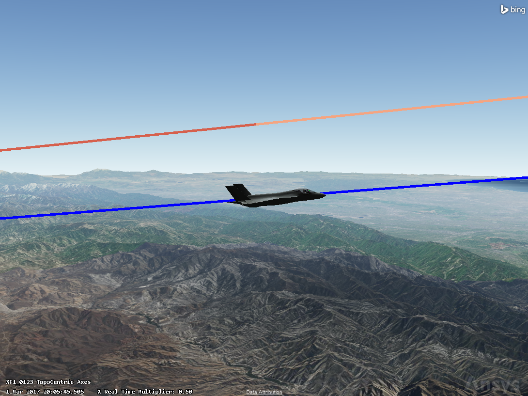
You now see the ownship route is colorized based on the Dynamic Pressure values. If you zoom in to the route, you see both the CAS and Dynamic Pressure contour lines, with the Dynamic Pressure offset from the ownship’s route so you can easily compare their values during flight.
Adding Dynamic Data Displays
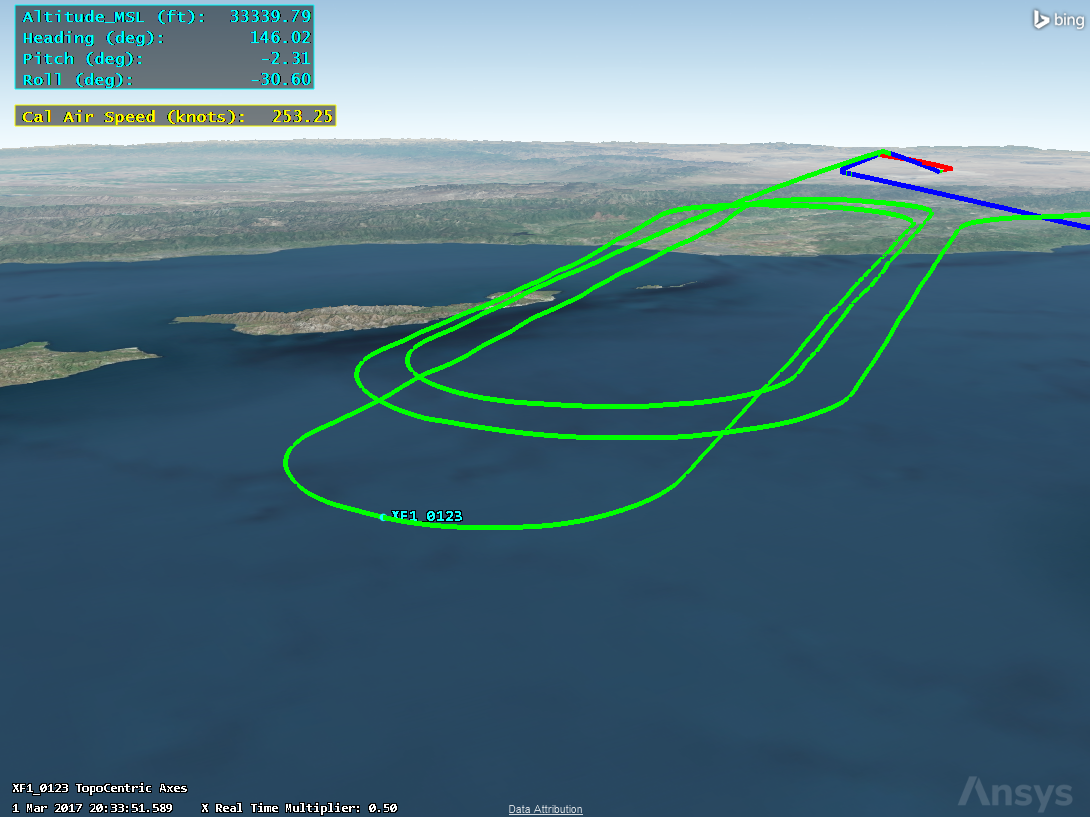
Dynamic Data Displays enable users to show time varying text on the 3D Graphics window. These can be also be colorized by a variety of schemes.
- In the Flight Analysis Tool toolbar, click the Display Flight Data (
 ) button.
 - Name the data display AltHeadingPitchRoll.
- From Ownship.csv, move (
 ) the Altitude_MSL, Heading, Pitch, and Roll to the Selected Elements table.
 - Set the following units as needed:
- Altitude_MSL to ft.
- Heading, Pitch, and Roll = deg.
- Above the Selected Elements section, click .
- Under Data Display Settings, change the color to cyan (light blue).
- Verify that autowidth is enabled and set Decimal Digits to 2.
- Under Location in Window(s), click the top left box.
- Click .
- Click the Display Flight Data (
 ) button to add another data display.
 - Name the data display CAS.
- From Ownship.csv, move (
 ) the Cal Air Speed to the Selected Elements table. Verify the unit as knots.
 - Verify that autowidth is enabled and set Decimal Digits to 2.
- Next to the Display Interval, click the Time Component button (
 ).
). - Expand the XF1_0123 aircraft and double-click the CAS_230-280knots interval.
- Under Location in Window(s), click the top left box.
- Change the Y Translation to 110.
- Click .
- Save your scenario.
You now see the calibrated air speed value displayed in the 3D Graphics window only during the time where the CAS is between 230 and 280 knots (green contour line).
Adding a Scalable Vector Graphic (SVG) data display
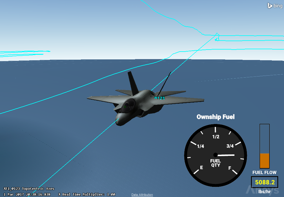
Scalable Vector Graphic (SVG) is an XML-based vector image format for defining two-dimensional graphics, having support for interactivity and animation. The SVG specification is an open standard with broad use. SVGs can consist of shapes, images, and text. The TETK capability enables use of SVGs in STK and provides a set of keywords to hook data from your scenario to elements within an SVG.
To load an SVG to represent a fuel gauge:
- In the Flight Analysis Tool toolbar, click the Display Flight Data button.
- Name the data display Fuel_Gauge.
- Under Ownship.csv, move (
 ) Fuel State and Fuel Flow to the Selected Elements table.
 - Change the units for Fuel State to lbs and the units for Fuel Flow to lb/hr.
- Remove the text in the Display Text column and uncheck the Show Units checkbox for each element.
- Under Location in Window(s), click the bottom right box.
- Set Decimal Digits to 1.
- Set Translucency to 100.
- In the upper right of the property window, click the ellipsis button next to the SVG drawing field.
- Browse to C:\Program Files\AGI\STK_ODTK 13\Help\STK\TeTraining\Training files\SVGs and open the Fuel_Gauge_Ownship.svg file.
- Click OK.
- Animate the scenario back and forth to observe the SVG components changing.
Adding event markers
Icons can be attached to flight paths at specific event times to indicate when and where certain criteria are met. These events can be defined as any time a selected metric crosses a minimum and/or maximum value.
When you created the Metric Satisfactions Intervals, you automatically created corresponding EventMarkers.
- Toggle on the CAS_230-280knots EventMarker (
 ).
). - Right-click the CAS_230-280knots EventMarker and choose Properties.
- Select the Icon check box and click the ellipsis (
 ) to browse for an icon.
 - Select the Finder_Yellow2.png icon and click .
- Click .
- Toggle the event marker off again to keep the 3D window clean.
You can also double-click an object in the Flight Analysis Tool tree to open up its Properties.
Now you have event labels and markers for the start and stop times of the CAS_230-280knots event interval.