Sensitivity Summary Plot
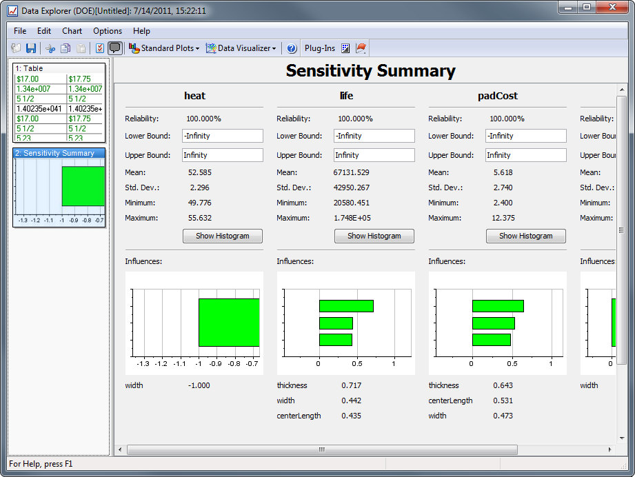
The Sensitivity Summary allows visualizing how much the design variables influence each of the responses. The summary also shows a few statistics for each response including bounds, mean, standard deviation, and reliability.

Settings
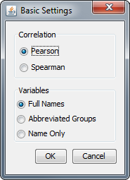
To configure the Sensitivity Summary page, select the Basic Settings option from the Chart menu:

The first option is for which analytical method to use in calculation correlation:
- Pearson - Pearson is a standard parametric method for calculating correlation.
- Spearman - Spearman's is a correlation method based on rank ordering of the samples.
For more information on these methods please refer here.
The second option determines how the variable names are shown in the graph:
- Full Names - Shows the full name of the variable, e.g., Model.pad.padCost
- Abbreviated Groups - Shows the first letter of each group before the final, e.g., M.p.padCost
- Name Only - Shows only the last portion of the variable name, e.g., padCost
Top Section

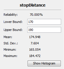
The top section of each response summary details some overall statistics:
- Reliability - The percentage of runs that meet the specified bounds.
- Lower Bound - A custom set lower bound on the response variable for the purposes of calculating reliability.
- Upper Bound - A custom set upper bound on the response variable for the purposes of calculating reliability.
- Mean - The mean value of the response variable data.
- Standard Deviation - The standard deviation of the response variable data.
- Minimum - The minimum value of the response variable across all runs.
- Maximum - The maximum value of the response variable across all runs.
- Show Histogram - Clicking adds a Histogram Plot for the response variable.
Influences Section
The Influence sections shows a compact Tornado Plot as well as a listing of the numerical values of the influences. For some background on correlation figures, values range between -1 and 1, with values farther away from 0 indicating a stronger correlation. Correlation values greater than 0 indicate a positive correlation, i.e., Rain is positively correlated to wet sidewalks. Correlation values less than 0 indicate an inverse correlation, i.e., Sunny days are inversely correlated to wet sidewalks.
This section has 2 other features of interest:
- Double-click a plot to view a full Tornado Plot for the response variable.
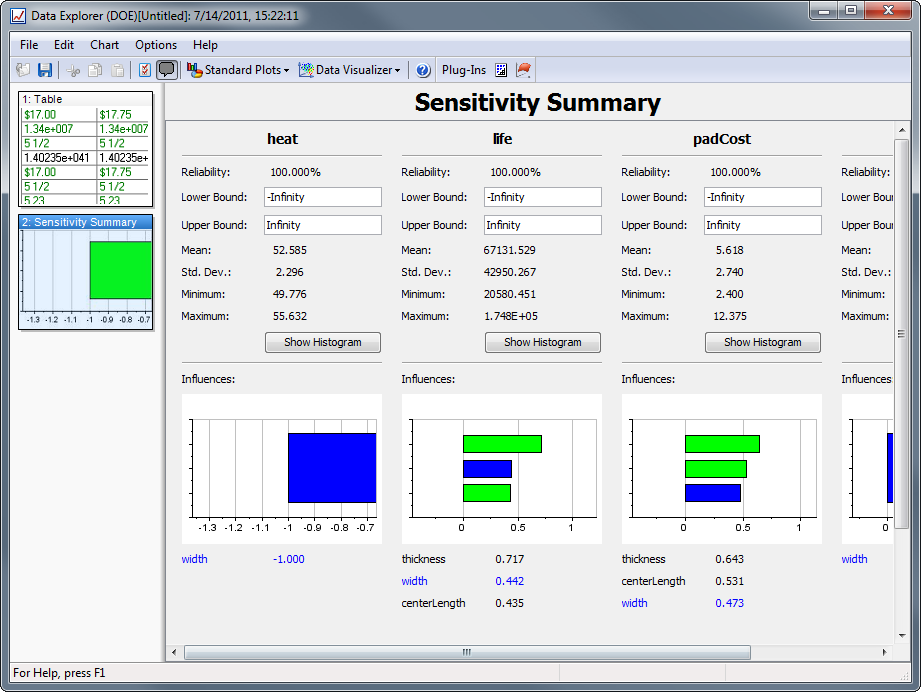
- Clicking a bar in any graph or in the listing will highlight that variable across all the graphs, allowing better visualization of a particular design variable's influence across all responses.

See Also: Data Explorer | Histogram Plot | Tornado Plot