Gantt View Properties Form
The Gantt View Properties Form allows you to modify how the tasks are displayed in the Gantt Chart.
To view the Gantt View Properties Form, select View ->Gantt View Properties... from the Astro Scheduler Engine Menu Bar.
Gantt View Properties Form
The Gantt View Properties Form is divided into 3 tabs:
- General
- Filtering
- Colors and Labels
General Tab
Sorting Options
The Task Start Time option button, when selected, causes all of the tasks in the Task List to be sorted in ascending order by the tasks' start times. The Task Name option button, when selected, causes all of the tasks in the Task List to be sorted in ascending alphabetical order by the tasks' names.
Grouping Combobox
The Grouping type combobox allows you to select the method by which tasks are grouped (ungrouped, by Group Name, by assigned STK object type, or by Resource).
Show Timeslots Checkbox
The Show Timeslots checkbox allows you to select whether or not the available timeslots for each task will be displayed on the Gantt chart.
If an Astro Scheduler Engine deconfliction algorithm has not yet been run and the Show Timeslots checkbox is not checked. The Gantt chart will appear blank.
Show Unassigned Tasks Checkbox
The Show Unassigned Tasks checkbox allows you to select whether tasks that are not assigned will appear in the Gantt view.
If the Astro Scheduler Engine deconfliction algorithm has not yet been run and the Show Unassigned Tasks checkbox is not checked. The Gantt chart will appear blank.
Show Task Labels Checkbox
The Show Task Labels checkbox allows you to select whether task names will appear on the Gantt chart whenever a task receives an assignment.
Rollup Tasks Checkbox
The Rollup Tasks checkbox allows you to select the "rolling up" of recurring or task groups on the Gantt chart. When a task is rolled up, only one task will appear for each recurring task or task group in the Gantt. When Rollup Tasks is not selected, a task for each task instance will appear in the Gantt view. (See Task Types for more information).
Show Resources Checkbox
The Show Resources checkbox allows you to select whether resource availability histograms will appear below the Gantt chart on the main Astro Scheduler Engine Gantt view window.
Show Assigned Tasks Checkbox
The Show Assigned Tasks checkbox allows you to select whether tasks that are assigned will appear in the Gantt view.
Gantt Font Size Numeric Up Down Control
The Gantt Font Size numeric up/down control allows you to modify the font size of the task names, task labels, resource names and the timescale labels in the Gantt chart. The smallest font size is 6.
Filtering Tab
Filtering Type Combobox
The Filtering Type combobox contains the different filtering options from which you may choose. The unfiltered option is the default and displays all tasks. You may elect to filter tasks by assigned time period, group association, or by assigned STK object type, thus displaying only those tasks that meet the filter criteria specified.
Filtered Display Start Time
The Start Time textbox allows you to select the start time for filtering tasks in the Gantt view. Entries may be typed directly into the control. Alternatively, the  and
and  buttons may be used to select the start time.
This control is visible only when Filtering Type Combobox is set to Time.
Filtered Display Stop Time
The Stop Time textbox allows you to select the stop time for filtering tasks in the Gantt view and table view. Entries may be typed directly into the control. Alternatively, the and buttons may be used to select the stop time.
This control is visible only when the Filtering Type Combobox is set to Time.
Task Group Combobox
The Task Group combobox allows you to specify the task group name associated with the group filter name.
This control is visible only when the Filtering Type Combobox is set to Group Name.
Add Filter Button
The Add Filter button places the filter shown in the filtering type combobox into the Selected Filters Listview.
Remove Filter Button
The Remove Filter button deletes ta highlighted filter from the eh Selected Filters Listview.
Selected Filters Listview
The Selected Filters Listview displays a list of all the filters to be applied to the Task List and Gantt chart. Only tasks that have attributes that match the filters shown in the control will be displayed.
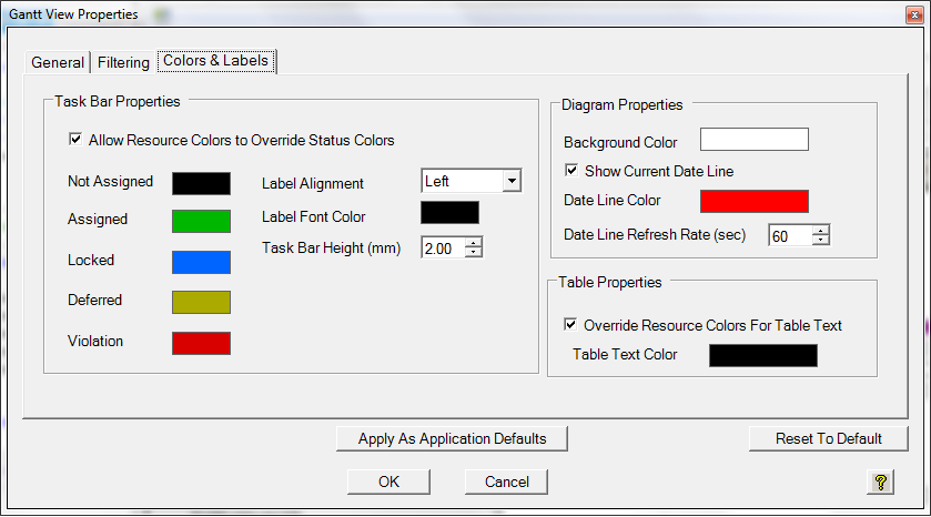
Colors and Labels Tab
Allow Resource Colors to Override Status Colors Checkbox
The Allow Resource Colors to Override Status Colors checkbox allows you to select whether the Gantt will show status colors (not checked) or resource colors (checked) for tasks assigned to resources that have overridden colors. If multiple resources with colors are assigned to a task, the color will be chosen based on the priority and name of the resources.
Task Bar Properties - Status Colors
The Task Bar Properties shows the colors that will appear for tasks on the Gantt for each status - Not Assigned, Assigned, Locked, Deferred, and Violation - for tasks that do not have resource colors assigned or for all tasks if "Allow Resource Colors to Override Status Colors" is disabled. Each task bar status color can be changes by clicking on the color and selecting a new color from the color form.
Label Alignment Combobox
The Label Alignment combobox allows you to select to align labels on top, bottom, left, or right of task assignments on the Gantt. If you select "None", then no labels will appear.
Labels aligned to the left or right of task assignments may overlap with timeslots or other tasks To alleviate any overlap, place labels on top or bottom of tasks. Line spacing is adjusted (increased) to accommodate labels on top or bottom of tasks.
Label Font Color
The Label Font Color shows the color of labels on the Gantt. The Label Font Color can be changed by clicking on the color and selecting a new color from the color form.
Task Bar Height (mm)
The Task Bar Height textbox allows you to select the height for each task bar on the Gantt in millimeters. Entries may be typed directly into the control. Alternatively, the and buttons may be used to select the Task Bar Height.
Diagram Propertied -Background Color
The Background Color shows the color of the background for the Gantt. The Background Color can be changed by clicking on the color and selecting a new color from the color form.
Show Current Date Line
The Show Current Date Line checkbox allows you to select whether a line indicating the current time will appear on the move across the Gantt.
Date Line Color
The Date Line Color shows the color for the dateline that appears on and moves across the Gantt display if Show Current Date Line is enable. The Date Line Color may be changed by clicking on the color and selecting a new color from the color form.
Date Line Refresh Rate (sec)
The Date Line Refresh Rate allows you to select how often to update the Date Line to show the current time. Entries may be typed directly into the control. Alternatively, the and buttons may be used to select the Date Line Refresh Rate.
Override Resource Colors for Table Text
The Override Resource Colors for Table Text checkbox allows you to select whether the Task Names on the far left of the Gantt will show resource colors (not checked) or the Table Text Color for tasks assigned to resources that have override colors.
Table Text Color
The Table Text Color shows the color for the Task Names on the far left of the Gantt for tasks assigned to resources that do not have override colors for all tasks if Override Resource Colors for Table Text is enabled. If Override Resource Colors for Table Text is disabled the Task Names on the far left will be the color of a resource assigned to the task. If multiple resources are assigned to the task, the color will be chosen based on priority and resource name. The Table Text Color can be changed by clicking on the color and selecting a new color from the color form.
Reset to Defaults Button
The Reset to Defaults button resets all Gantt View Properties to factory (if you have yet to specify new defaults) or user-specified defaults.
Apply As Application Defaults Button
The Apply As Application Defaults button applies the Gantt View Properties to any schedule viewed in Astro Scheduler Engine as default.
OK Button
The OK button accepts all of the attributes defined by the controls on the Gantt View Properties Form and then closes the form.
Cancel Button
The Cancel button ignores all of the attributes defined by the controls on the Gantt View Properties Form and then closes the form.